Changelog
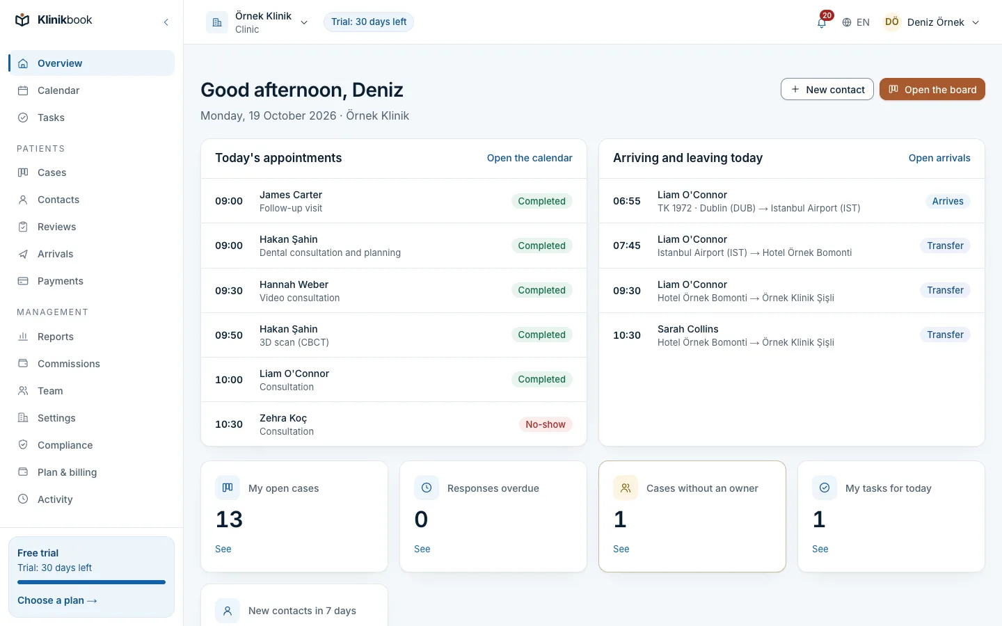
New look: one design system on every screen
Published 20 October 2026Updated 20 October 20261 min read
What changed
- Main action buttons use the brand blue; the side menu, the sign-in panel and the portal header are deep navy.
- Headings and key figures use a more readable typeface; body text in the workspace is slightly larger.
- The choice controls on the calendar, case, quote, payment and settings screens now share one component, and toolbars no longer overflow on a phone.
- The product screenshots on the website were retaken in the new design in Turkish and English; the portal's form, payment plan and trip screens were added.
Related reading
30-day free trial
Try Klinikbook with your own team
Every feature is open for 30 days, and no card is needed to start.